Stone Island – KT721

SI_Logo

Whilst wandering around the men’s department of Shinjuku Isetan, I came across a Stone Island counter. This would have been surprising if I had not already encountered one in the Mitsukoshi Department Store in Ginza a few days earlier, and now having the time I decided to peruse some items.

Isetan Map

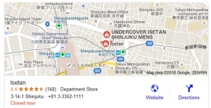
Isetan Shinjuku Map. Screenshot by author.

As Californian rapper Rasco once said, ‘Time waits for no man’, and indeed in my advancing years I find myself drawn to items I would never have considered in my early twenties. Noticeably knitwear, which although once considered only the province of my grandpa, I now know to be considerably cooler by virtue of the fact that Steve McQueen preferred to get around in shawl necks in his prime 1960s years.

McQueen-Cardigan

Steve McQueen Repping Wool. Photo stolen from web.

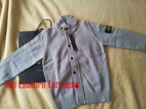
So, looking for a new item that bore no resemblance to anything else I owned, I chanced upon a funnel neck cardigan that I believe is rather generically named ‘KT721’.

Knitwear_1

Knitwear_2

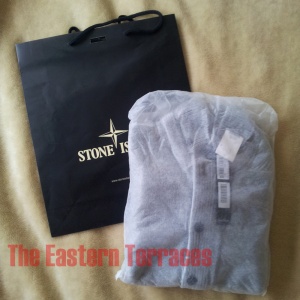
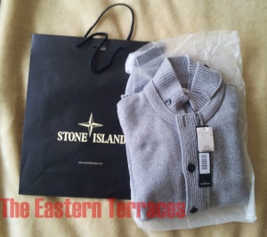
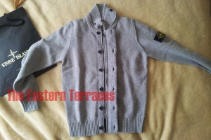
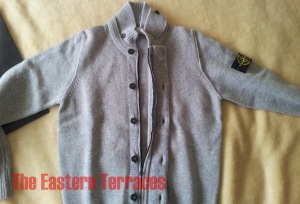
Unwrapping. Photos by author.

They come in a variety of colours, and without doubt white is – by far – the best looking one. I bought grey nonetheless, as having previously owned white clothes before, I know better than to ever, ever buy some again.  Unless of course, I wind up joining a cult… however presumably at that point, I am unlikely to be making my own choices regarding anything.

White VersionGray Version

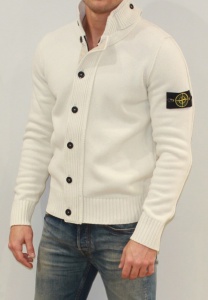
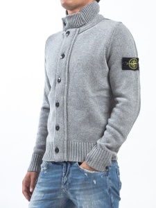
White Versus Grey. Photos stolen from web.

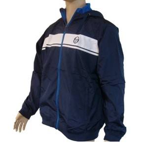
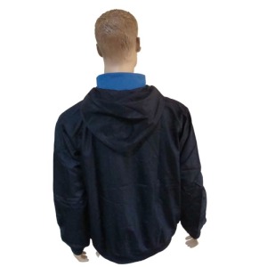
It has a traditional button up front with a sneaky zip underneath, a very warm neck that can button up on itself and the standard Stone Island compass patch on the left arm.

Knitwear_3Knitwear_5

Knitwear_6

Zip and Buttons. Photos by author.

Inside the garment, you get a few spares buttons as well.

Knitwear_7

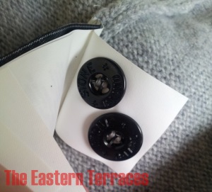
Spare Buttons. Photo by author.

The inside tag features some kind of clothing equivalent of microdot technology that enables the owner to identify whether it is legit or not and where it came from. Called Certilogo, interested customers can use the 12 digit code from the label  to check the authenticity of the item. Having bought this from a Japanese department store though I don’t feel the need, but appreciate the idea having seen how many fakes there are online.

Whilst hardly a bargain at close to $600 (AUD), this is nonetheless a comfortable, warm and in my opinion stylish piece of old man’s clothing.

Written and posted by Horatio Cornblower. Copyright 2015. All rights reserved.

Unauthorized use and/or duplication of this material without express and written permission from this blog’s author and/or owner is strictly prohibited. Excerpts and links may be used, provided that full and clear credit is given to the author and The Eastern Terraces with appropriate and specific direction to the original content.


LINKS:

Isetan Department Store: http://isetan.mistore.jp/store/shinjuku/index.html

[FYI, The Stone Island counter was located in what could only be described as the casuals section of the men’s department. Immediately adjacent were Montcler, Lacoste, Victorinox and Burberry/Aquascutum].

Stone Island: http://www.stoneisland.com/au

MONO Magazine

Mono Logo

Written and published in Japan, Mono is a pop culture document par excellence. Evidently aimed at men, it focuses on a variety of subjects, although predominantly features food, vehicles, fashion and technology with a slight emphasis – least in the issues I have seen – towards military history and its accoutrements.

Watch CoverUSA Cover

Articles have included the history of Japanese technology between the 1970s and 1990s, World War II bomber jacket designs, hand luggage and camping gear reviews and history of smugglers cars, whilst recurring features include convenience store food reviews and watch and shoe release updates.

Hand Luggage

Luggage Reviews.  Photo by author.

Combini Comparisons_4 Combini Comparisons_3 Combini Comparisons_2 Combini Comparisons_1

Convenience Store Food Reviews.  Photo by author.

Bikes

Motorcycle Reviews.  Photo by author.

Smugglers Cars

Analysis of bootlegger smuggling.  Photo by author.

Their authors tend to analyse the less covered segments of these common areas too. For example, in their USA Issue, they travel to the Mexico / USA border and speak with border patrol guards and check out dive bars in Juarez. When they look at shoes, it’s what’s on the feet of tech nerds or the best 1980s jogging shoe. If it’s watches, they ignore the Swiss and instead turn their attention 1970s Tokyo time pieces or Timex and low grade military watches.

USA Article USA Border2

USA Issue.  Photo by author.

Nerd Sneakers

Tech Company CEO Footwear Analysis.  Photo by author.

80s Sneakers

1980s – 1990s Jogging Shoe Analysis.  Photo by author.

70s Japanese Watches

Japanese Watches of the 1970s.  Photo by author.

Sadly, as my Japanese is poor, the virtue or lack thereof of the writing is impossible to analyse, but it is incredibly photo heavy and its attention to detail is on par with a variety of Japanese periodicals which seem to focus on the minutiae of their topics with an autism like focus.

Jeep Timex  WWII Bomber Jackets

Various Articles.  Photos by author.

Through their own shop, advertised in the back pages, they also sell many items such as authentic Vietnam issued Zippos, C-rations, military styled patches, pens, watches and various other items.

Vietnam Zippos Military Patches

Example Items Available Through Their Mail Order Shop.  Photo by author.

Freely available in many bookstores and libraries in Japan, it’s worth picking up and always entertaining.

Written and posted by Horatio Cornblower. Copyright 2016. All rights reserved.

Unauthorized use and/or duplication of this material without express and written permission from this blog’s author and/or owner is strictly prohibited. Excerpts and links may be used, provided that full and clear credit is given to the author and The Eastern Terraces with appropriate and specific direction to the original content.


LINKS: http://www.monomagazine.com/

FTC N-3B Jacket

 FTC 3B Front

Haight Street in San Francisco has few good shops. There is the superlative Amoeba Music which is a great place to find rare tunes and tee-shirts, but unless you want to buy weed and numerous accoutrements with which to smoke it, seemingly little else.

FTC Store Front

So it was with a smile on my face, I stepped into FTC. Located at 1632 Haight Street, FTC is a skateboard shop that has existed for over 20 years and has contributed significantly to both the local and world skateboard scene. Having championed street skating and street style in the early 1990s, FTC sponsored riders were a main stay in the photo spreads of Thrasher and Transworld when I was growing up, and finding the store by accident was a bit of a thrill.

Small, clean and well laid out in a split level style, the store didn’t feel like the skate shops I grew up frequenting at all. More like an upscale boutique. The staff were helpful but laid back, and didn’t bother me while I tried on a number of jackets or make me feel like I needed to buy something or get out.

I was in the market for a warm winter coat, as I was due to fly to New York within a few hours, and pulled out an N-3B jacket from the racks. These come in both black and khaki and contain heaps of pockets (about 10), a quilted lining and alterable cuffs. The fluffy part of the hood is attached with studs and easily removable.

FTC 3B Open

FTC 3B Hood

N3B Blk Vs Green

The staff claimed that they are made in Japan, but despite the label appearing to be written in Japanese, I believe they are actually manufactured in China.

FTC 3B Label

After toying with the idea of buying the black one, I eventually plumbed for the green as I have too many black jackets and felt it was reminiscent of NAS’ in the ‘Ain’t Hard To Tell’ video.

nas (2) nas2

They had a number of other cool jackets as well such as this hardcore spin on the MA1 flight jacket.

ftc_alpha_ma1

(FTC x Alpha Industries MA-1 – Picture obviously stolen from the web)

And this slick looking law enforcement inspired number below…

FTC Hood

(FTC Hooded Team Jacket– Picture obviously stolen from the web)

Combined with a black beanie I bought in the same store, I stayed toasty throughout my time in New York in February, so the jacket definitely keeps you warm and the array of pockets proved really useful. Check out the store if in the area or the websites if you ain’t.

FTC N-3B Jacket2

FTC N-3B Jacket5

 (Above two pictures obviously stolen from web)

Store / Company website: http://ftcsf.com/

Jacket for Sale: http://global.rakuten.com/en/store/ones-gp/item/ftc_n3b_jkt/

Written and posted by Horatio Cornblower. Copyright 2015. All rights reserved.

Unauthorized use and/or duplication of this material without express and written permission from this blog’s author and/or owner is strictly prohibited. Excerpts and links may be used, provided that full and clear credit is given to the author and The Eastern Terraces with appropriate and specific direction to the original content.

2014 – The Future is Here Part I

So this confused decade is almost halfway done and finally a musical and stylistic identity begins to emerge. Pretty much just like the last decade took a while to get into its stride too. In the last few months there’s been an abundance of releases which have really started to deliver on the promise of 2013 and that Logos album. More importantly, most of these releases are by artists that I hadn’t even heard of 12 – 18 months ago.  There’s a real feel of a new generation emerging, and some of the giants of the ’04 – ’09 era are starting to look like dinosaurs to me.

More importantly, I feel like there’s been one of those rare foot-centric seismic shifts that truly mark an era changing: yes I’m talking about the eternal swing of the pendulum from Nike to Adidas and back again.

The last time I felt an era-change – the middle of last decade when it was clear that dubstep was going to explode – was also the last time that I felt the pendulum swing from Nike to Adidas. The early part of the decade had been all about the Air Force 1 and, somewhat embarrassingly, the Bape Sta.  Then about the time of Dubstap Warz, I moved under the influence of casual culture and began a massive reappraisal of, shall we say, the more “European” end of Adidas. I spurned the obvious styles like the Shell Toe to begin an almost decade-long excavation of models like the Forest Hills, the Trimm-Tabb and the Munchen.

Now while I still adore those styles (in the overall pantheon of trainer greatness, will the Forest Hills ever be bettered?), I’ve slowly started to wake up to the painful reality that while those models were absolutely cutting-edge technology in their day, Adidas doesn’t really produce much in the way of exciting new trainers now.  In fact many of them are downright ugly, and the whole Adidas Originals schtick of continually re-releasing the golden designs of the early to mid-80s is wearing a bit thin.

Now on the other hand with Nike, the ubiquity of the Air Force 1 was putting me to sleep by the middle of last decade. And yet I now have to admit that it’s Nike and not Adidas that is making some new  trainers that you would both actually want to wear and that somehow capture the zeitgeist.

With the release of the Free Flyknit 4.0 Nike have released what I believe will be one of the defining trainer silhouettes of this era. Mixing the Nike Free sole and the Nike Flyknit upper, they combine two iconic pieces of Nike technology that left Adidas far behind. Stylishly blending form and function for a look that manages to stand out as new even after 40 years of modern trainer design, I haven’t been this excited about a new trainer since…well since I started collecting trainers.

Nike

IMG_0095

And it’s not just shoes where Nike are now winning the arms race. NSW keeps kicking goals with lines like the Gkyakusou running range, the collaborations with FFF and FCRB.  When was the last time you wanted to actually wear a piece of clothing from Adidas that wasn’t a classic item dating back from the 70s?

And so in a roundabout way, I come to music. As I said, the last few months have seen a whole exciting new generation of producers break through (or maybe I only just recognised that they are breaking through). I’ve spent a whole lot of time recently listening both to these new producers and to recent releases by some of my heroes of the 00s. In my next post I’ll deal with the producers that really excite me now, but first some thoughts about two of my old favorites: Hyperdub Records and The Bug.

The inescapable conclusion when listening to the recent Hyperdub 10 series of albums is that this once untouchable label is having a bit of an Adidas moment: iconic and era-defining in its glory day, but now distinctly bloated and tired. Was there really a need for an interminable series of compilation albums to celebrate the 10th anniversary? Why sign so many tedious American producers? What was once a lean and  focused operation now seems like a less-interesting Warp records wannabe. I shan’t listen to any of the Hyperdub compilations more than once, and have almost zero interest and curiosity about what Hyperdub might put out next.

bug

The Angels and Devils album by The Bug is, on the other hand, something I have listened to many times over the past few weeks. By my reckoning I’ve been following Kevin Martin a.k.a The Bug’s various projects for a ridiculous 22 YEARS, ie: longer than many of his current fans have been alive. His musical evolution has paralleled my own tastes in many ways, or perhaps even shaped them.

But while Angels and Devils probably has a lot more listening in it for me, I’m already clear that it’s just a further refinement of what he’s been doing for the last 15 years at least. Yes it may be his best single cohesive album to date but there is no shock of the new here, nothing that makes it feel like it actually helps define this moment in time the way London Zoo did in 2008 or indeed the way his masterful compiling of the Virgin Ambient series did in the mid-90s.  Somehow Angels and Devils feels like a good late period Neil Young album. Nice to see an elder statesman continuing to craft great albums, but it doesn’t really feel relevant to the era any more.  Still, Fat Mac is probably the single greatest Kevin Martin/Justin Broadrick collaboration to date.

Right then, next time I’ll write about the music that really excites me now.

Gunter Logo

Posted by Gunter Sacks

We Are FUCT

StickerI first came across FUCT in the pages of Thrasher around 1993. Their advertisements stood out amongst all the others by being far more subversive and dare I say, cooler than all the other wanna be radical labels that paid for space within the magazine. They were bold, post modern and announced their presence without really saying who they were or indeed, giving many clues as to what they did. Hooked on their anti-advertising, I discovered one of the first and without doubt the best ‘street wear’ clothing label ever devised. FUCT.

Fuct 1993 Thrasher AdFUCT 1995 Ad

Thrasher Ad 1996FUCT Ad

Advertisements from early 1990s Thrasher (Pictures stolen from the Web)

Founded in Los Angeles by Erik Brunetti in 1991, the label co-opted pop culture icons like the poster for Jaws, the gangsters from Goodfellas and faces of Kiss and used them Jamie Reid style on their tee-shirts, hoodies and caps. The well worn Ford styled ‘FUCK’ from many a 1960s counter cultural tee-shirt was recycled into their logo whilst the apes from 1968’s ‘Planet of the Apes’, found themselves holding crack pipes and peering out from the underside of decks.

Fuct 1994 Ape AdFuct Ford Logo

Growing up in pre-internet Australia, their oeuvre was both exceedingly hard to get and ridiculously expensive if ever found. No one would recognise it if worn, except for other skaters and wearing it while skating, it would usually get messed up. It did have a nice shock value though and sporting it and watching people smirk or snarl when they read the logo or saw the pictures was part of the fun, and eventually I managed to afford and get my hands on a few items, including this well-loved hooded top as seen below. [In case you wonder why I still have it, I am planning on giving it to my grand children].

1993 Era Hooded Top SMALLFuct 1994 DetailSMALL

It was painful to see Bathing Ape later co-opt and essentially steal Brunetti’s ideas and found an entire label based around one set of designs, but I digress…

Fuct 1994 Ape AdFUCT ApeThrasher Ad

Fuct 1994 Top SMALLBathing Ape 2002 SMALL

As the reason I am writing this is to show some love for the recently released Fuct hardcover book. Truthfully it was released a while back, but time is a cruel mistress… Nonetheless, it is a cornucopia of great pictures and wild ideas laid bare, and it sketches the story of FUCT while supplying plenty of pictures of ideas, sketches and design processes.

Cover SMALLBook Cover Stamped SMALL

Cover sleeve and embossed hard cover…

Graffitti Book SMALLGives way to Brunetti’s beginnings as a writer…

Book FUCT Logo SMALLCreating prototype logos…Book FUCT 1993 Ad SMALLIncludes the original acetate copy of the advertisement shown above whch was one of the first FUCT ads I ever saw…

Book Goodfellas SMALLBook Ape Sketch SMALL

Shows iterations of the aforementioned Goodfellas and Ape designs…

Book Ape Deck SMALLBook Lemmy SMALLAs well as this bad-ass Lemmy promotional poster…

Book Bad Brains SMALLApparently HR from Bad Brains lived in Fuct’s warehouse for a while…

Book Larry Clark SMALLAnd Larry Clark was a fan and collected their tee-shirts…


Over time Brunetti’s tastes evolved towards a sympathy with the late 1960s and early 1970s counterculture and the designs take on unique elements of those times, including the use of Sharon Tate’s and Anita Pallenberg’s faces in advertising material, a series of designs based around Vietnam (such as grunt’s helmets a’la the cover of Michael Herr’s Dispatches and patches worn by special forces), Easy Rider magazine style artwork, Playboy and Gilbert Shelton cartoons. Of particular note, is the fact that Brunetti managed to successfully trademark the Symbionese Liberation Army’s seven headed serpent logo. Presumably no wished to claim credit for it, or if they did, they were dead or in jail.

Patty Hearst with Machine GunFuct SLA Tee

However, it is this kind of idea that makes FUCT who they are, and in a world filled with sell-outs that cash-out at every available opportunity, I am grateful that they still exist and are still seditious over 20 years on from the label’s inception. Check it out if time and inclination permits…

Written and posted by Horatio Cornblower. Copyright 2014. All rights reserved.

You can find the book at http://www.amazon.com/FUCT-Erik-Brunetti/dp/0847839664

Fuct’s website is http://www.fuct.com


Unauthorized use and/or duplication of this material without express and written permission from this blog’s author and/or owner is strictly prohibited. Excerpts and links may be used, provided that full and clear credit is given to the author and The Eastern Terraces with appropriate and specific direction to the original content.

More relics of Porfirio’s 1935 Shanghai Trip

In case any readers are tantalised by the last post’s reference to Porfirio Crane’s 1935 Shanghai trip, I present this artist’s impression of Porfirio’s arrival at the Cathay Hotel’s 1935 New Year’s Eve Party.  At this time Porfirio was rocking his “bare ass” look, which some analysts of style consider to be equally as significant as the adoption of the deerstalker hat by certain northern clubs in the 80s.

Porfirio

Out and about in Shanghai

Inspired by Casual Connoisseur’s “Out and About” series, Gunter hits the Bund

A few weeks ago I had the chance to nip over to Shanghai for the first time.

IMG_1273

Flight delays conspired to make this a very short trip, and I didn’t get to cram in all I wanted. Still, I think I got in a little bit of the vibe of the city during the jazz age, when it proudly went by the title “whore of the orient”.

I was surprised by how clean and orderly the parts of Shanghai that I visited were. The bit of the Huangpu river where the Bund overlooks Pudong is positively gleaming, the buildings of the Bund perfectly restored and sitting behind a brand spanking new riverfront promenade. All in all, a much more pleasant experience than Beijing.

Thanks to the aforementioned flight delays we only had one proper evening on the town, and we made use of it by visiting Fu 1088.  Somewhere in or near the former French concession, and set in  a colonial bungalow that might have housed a moderately prosperous expat bank employee in the early 1930s.  Private rooms only, where high-end Shanghainese cuisine gets served up amongst faintly chipped and worn remnants of the city’s heyday. As this is not a food blog, I’ll save you the descriptions, but the food was damn good.

Some shots inside Fu 1088:

IMG_1297

IMG_1298

Gunter wears a Moncler Gamme Bleu Oxford Shirt while preparing to tuck into a tea egg with caviar:

IMG_1294

After dinner we took a taxi back to the riverside to stroll along the wonderfully restored Bund. The dowdy vibe of “Clive James’ postcard from Shanghai” is long gone. We popped into the building which used to house Shanghai’s British Club. Now converted into the Shanghai Waldorf-Astoria hotel, it boasts a recreated version of the British Club’s notorious Long Bar – all in all a step up from the mid-90s days when it housed a KFC.

To my immense surprise the jazz trio in the Long Bar (bass, drums, piano) was several light years beyond the usual Asian hotel lobby “jazz band” hacks, and managed to jam out something which to these ears sounded like late 50s hard bop.

Gunter prepares to down a passable Gimlet at the Long Bar while listening to jazz:

IMG_1295

While our stay was short, the whole jazz age vibe of the trip was considerably enhanced by having chosen the Fairmont Peace Hotel as our digs. Close to the northern end of the Bund, the hotel is actually the former Cathay hotel, now immaculately restored.

When it opened in 1929, the Cathay was the most luxurious hotel in Asia and luminaries such as Charlie Chaplin, Noel Coward and Douglas Fairbanks passed through its doors:

Cathay-Hotel-postcard-in-early-1930s

The restoration job is great, and the whole building is fascinating to wonder around in, but the slightly deserted nature of some of the public rooms on the upper floors gave of the vibe of a more art deco version of the Shining:

IMG_1247

IMG_1244

It’s even more spooky when you consider that these rooms once housed the most happening night club in Shanghai, complete with jazz band and Russian prostitutes.

The actual rooms themselves are extremely well appointed and the ground floor with its’ art deco galleries is also a great place for loitering. I even managed to sneak an “Acid Casuals” T-Shirt into one of the shots:

IMG_1258

IMG_1255

IMG_1263

IMG_1283

IMG_1289

IMG_1292

IMG_1291

The last day on Sunday was spent exploring the vicinity of the Bund and sneaking in a brief interview with Subculture Shanghai main man Drunk Monk (coming soon to this blog) before taking the Maglev to the airport. All-in-all, I can’t wait to visit Shanghai again.

Gunter crosses the bridge over Soochow creek and ponders the Broadway apartments:

IMG_1269

Pondering Andre Malraux in the Farimont Peace Hotel’s fantastic French Bakery:

IMG_1252

But before closing out this post, a special mention is needed for the builder of the Cathay Hotel – the notorious Victor Sassoon, a man who would merit a long Eastern Terraces post of his own.

A member of the notorious Sassoon family of Baghdad jews whose commercial interests followed the British Empire eastwards, he first intended the Cathay Building to be an office building, but later changed his mind and put the city’s most luxurious hotel and most happening nightclub on the upper floors. Never one to do things by halves, he then ensconced himself in a penthouse suite on the top floor (in the pyramid-like structure you can see on top of the hotel). Following an air crash and partially crippled, he walked only with the aid of two canes.  Convinced therefore that women would only love him for his money, he dealt with the problem by postponing marriage until old age (he eventually married his nurse) and in the meantime regularly putting some of the city’s most beautiful European and Chinese women on his payroll. As one article puts it:

“Sir Victor had four major passions: beautiful women, thoroughbred horse racing, Chinese art, and photography…..Sir Victor not only had white lovers, but also Chinese ones, at a time when this was uncommon. He often photographed his conquests in the nude, thus combining his interests.”

http://suite101.com/article/sir-victor-sassoon-builder-of-1930s-shanghai-a132604

Sir Victor’s hight times in Shanghai definitively ended with the Communist takeover, whereupon he retired to the Bahamas and remarked: “Well, there it is…..I gave up India, and China gave me up.”

A photo of the great man (one hopes this lady was not one of the ones on his payroll):

sassoon

Finally, a picture of the guidebook that Porfirio Crane carried with him on his 1935 visit to Shanghai:

shanghai

Posted by Gunter Sacks

Umbrella magazine

umb8_cover_lo

Since the weekend I’ve been delving into the eight issues of Umbrella magazine that have been published to date.

This was purely a chance discovery, due to a passing reference in the new edition of the Phil Thornton “Casuals” book (a review of that is coming post haste).

This is a sort of leftfield men’s mag, with articles on design, dressing, food, travel, music and socio-political issues. It exists mainly online, where all issues can be read or downloaded to iphone/ipad for free. Or, in an unabashed appeal to commodity fetishism, if any particular issue takes your fancy you can order a hard copy for your collection for about US$20 a pop.

As you would expect from a publication referenced in Phil Thonton’s book, at least some of the publishers seem to have a strong association with the terraces, so there’s plenty of football articles, the menswear section often focuses on Stone Island and CP Company and much love is shown to Boys’ Own fanzine. The first issue features a frothing-at-the-mouth appreciation of “Selected Ambient Works” by Aphex Twin and a reminisence by “Away Days” author Kevin Sampson on how he made the “Short Film about Chilling” documentary with The Farm. So this nails the “Eastern Terraces” demographic dead-on.

A kind of Wallpaper magazine by and for post-casuals, presented in nice, intellectually-undemanding (I mean that in the best possible way), bite-size, easily digestible chunks.

Highly recommended!

http://www.umbrellamagazine.co.uk/

Posted by Gunter Sacks

Sergio Tacchini Colorado Windrunner

I like me some Tacchini.

Nice materials and generally tasteful styles which along with Fila epitomise a certain era of the 1980s. Created by Italian tennis player Sergio Tacchini in the mid 1960s in order to add a splash of colour to an otherwise staid looking game, the brand later expanded to various types of casual wear over the next few decades.

Notable wearees include John McEnroe at the height of his career as well as Aryton Senna and a variety of casuals who discovered them whilst abroad on away games.

The Colorado Windrunner Hooded Jacket is a classic looking match day top. Not dissimilar to the Sergio Tacchini – Masters McEnroe Tracksuit Top, it is a simple two colour piece made from light material with a zip right down the middle. It is a considerably less well known (or obvious) design than the Dallas (which featured so prominently in Nick Love’s film ‘The Business’), but more contemporary and stylish in my opinion.

There is a logo stamped on the zipper as well as one on the chest and an inner piece features on the inside of the collar to keep the wearer warm. The top itself is very light and comfortable with good sized pockets on the sides.

I got mine in navy blue…

But they are of course available in a variety of colours…

Not too pricey and worth checking out.

Written and posted by Horatio Cornblower.

Unauthorized use and/or duplication of this material without express and written permission from this blog’s author and/or owner is strictly prohibited. Excerpts and links may be used, provided that full and clear credit is given to the author and The Eastern Terraces with appropriate and specific direction to the original content.